Colors and theming
The Colors accordion is where you make the banner feel like part of your website. Every visual element has its own color picker, so you can match your brand exactly.
Open the color settings
In your project, open Customization. On the Banner tab, expand the Colors accordion.
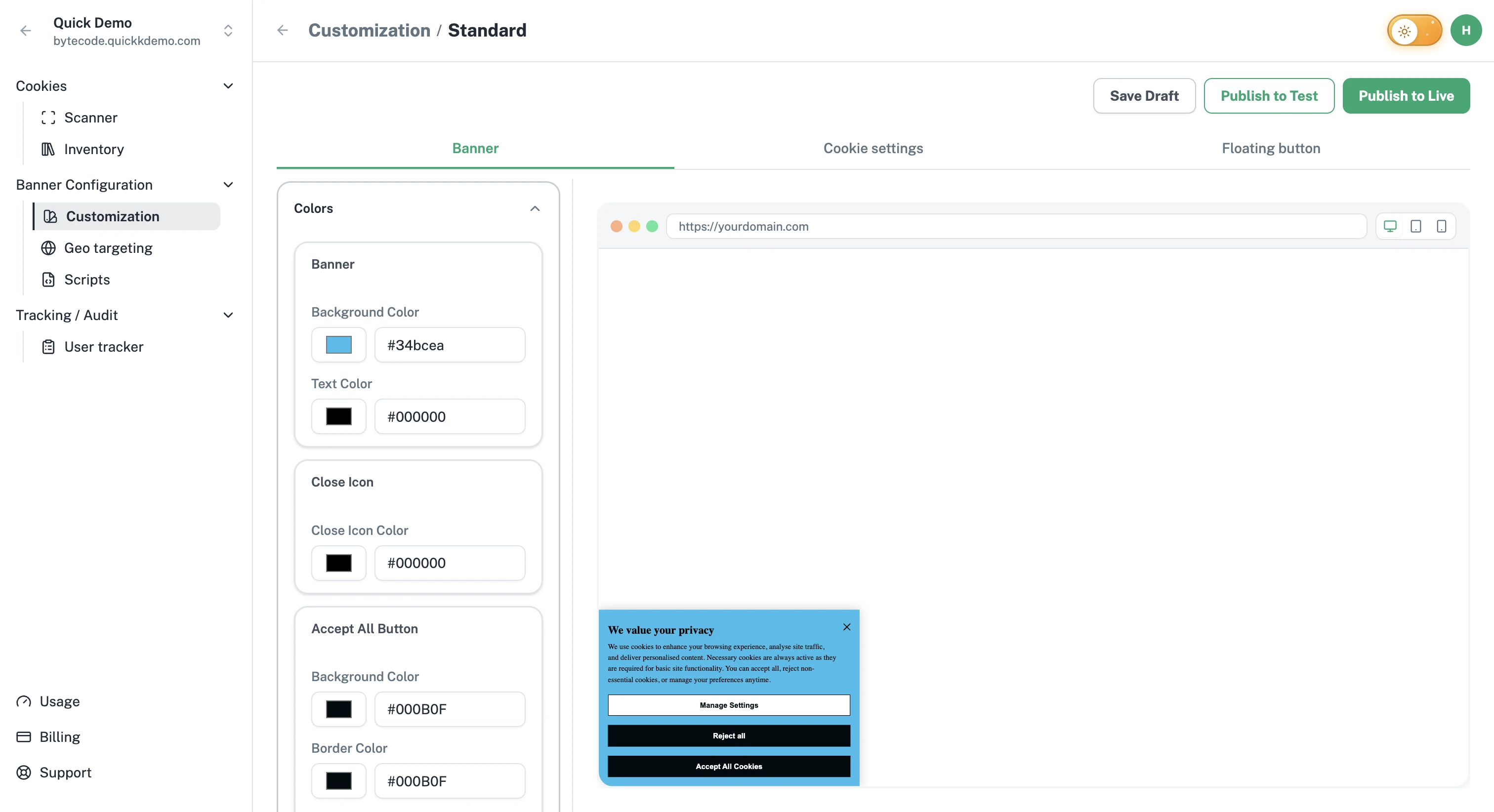
What you can change
Colors are grouped by element so it's easy to know what you're styling.
Banner
Background Color. The base color behind the banner content.
Text Color. The color of the banner text.
Close Icon Color. The X in the corner of the banner.
Accept All button
Background Color, Border Color, Text Color.
Reject All button
Background Color, Border Color, Text Color.
Manage Settings button
Background Color, Border Color, Text Color.
The button groups follow the banner type: an Acknowledgment Only banner has an Okay button color group instead of the three above, and a Do Not Sell banner has a Do Not Sell button group.
Each picker accepts a hex code or you can use the visual swatch to dial in the right shade.
Suggested approach
Pick your primary color first. Use it as the background of the Accept All button. That's the action most visitors will take, so it should feel like the main call to action on your site.
Use a secondary or neutral color for Reject All. Don't make Reject All harder to read than Accept All. Most laws require both buttons to be equally clear.
Keep the banner background neutral. White or very light grey almost always reads cleanest. Save bold colors for the buttons.
Match your text color to your website. If your site uses a dark grey for body text, use the same dark grey here.
Cookie Settings popup colors
The Cookie Settings popup has its own set of color pickers, organized the same way. See Cookie settings popup.
Floating button colors
The floating button has just two colors: button background and the cookie icon. See Floating cookie settings button.
Need more control?
If your brand uses gradients, custom fonts, or unusual button shapes, the Custom CSS editor lets you go beyond what the visual controls offer.